Graphic Design | Branding | Typography - Duration 7 Weeks
Lincoln Heights Campaign
A branded campaign advertising the Los Angeles neighborhood of Lincoln Heights.
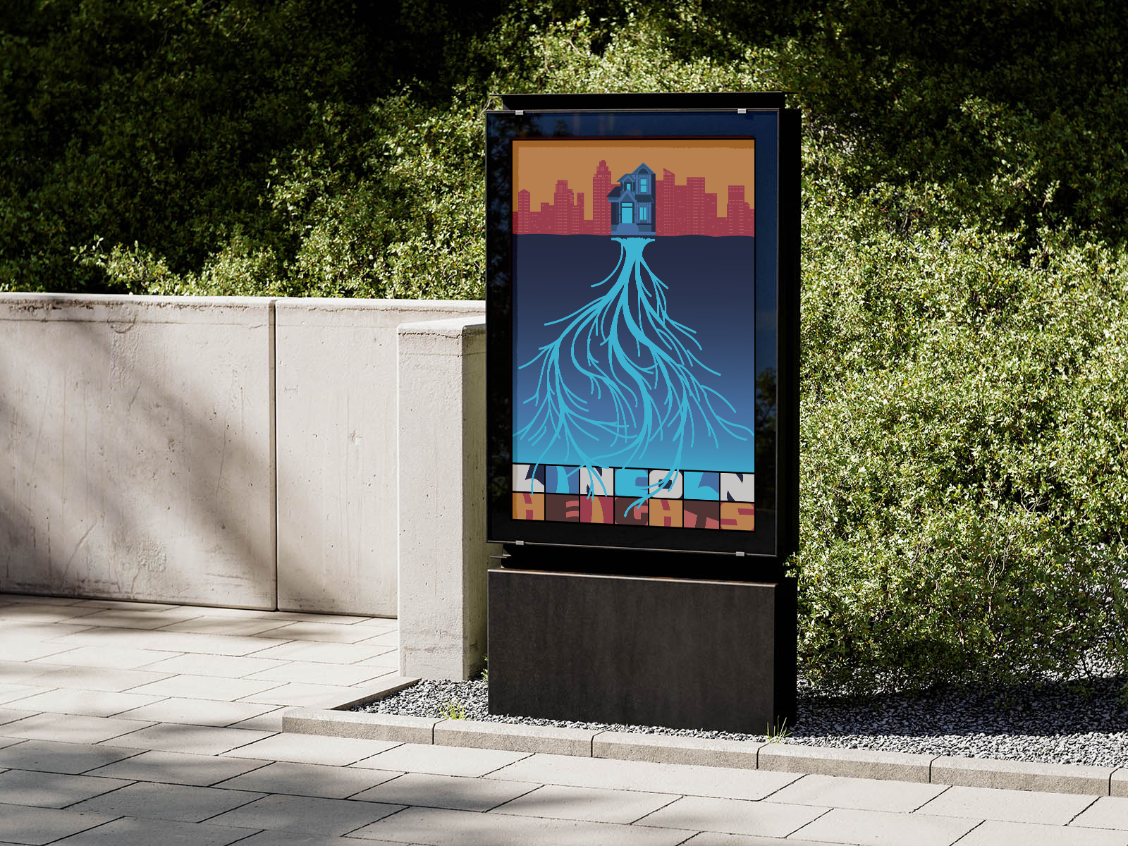

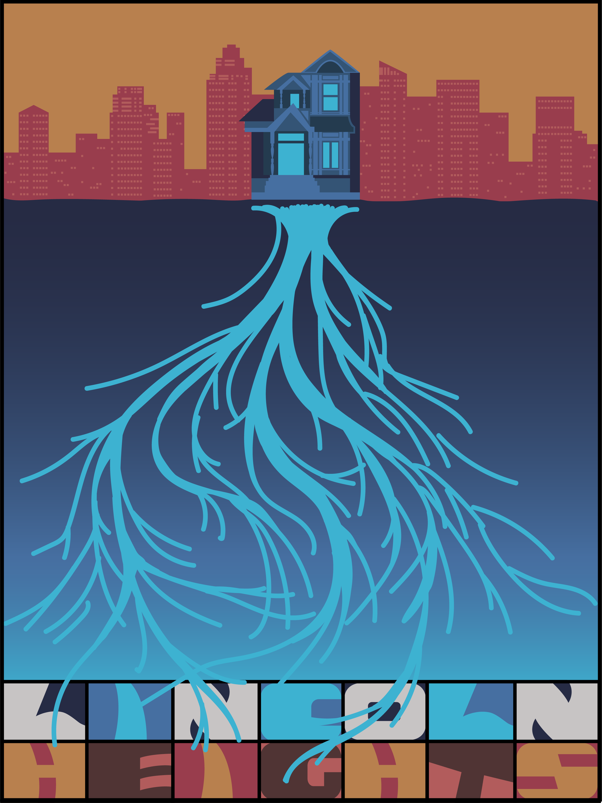
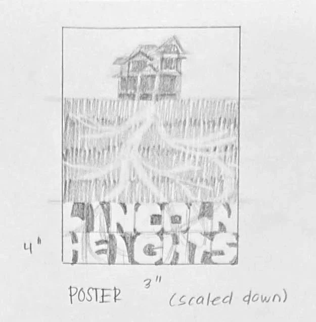
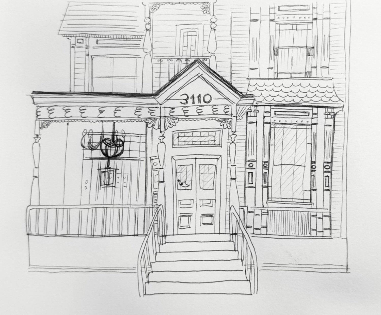
The objective of the research was to discover unique historical context leading to modern significance. As the first suburb in Los Angeles, Lincoln Heights is its original center. Today, it’s a thriving cultural center for the arts. For visual symbols, I chose HM157, an underground and historical cultural arts center, to represent current day Lincoln Heights. Tying it to historical relevance, I used roots at the center of the building to communicate the neighborhood’s long history as its literal “roots.”
“Rooted” in a long history.
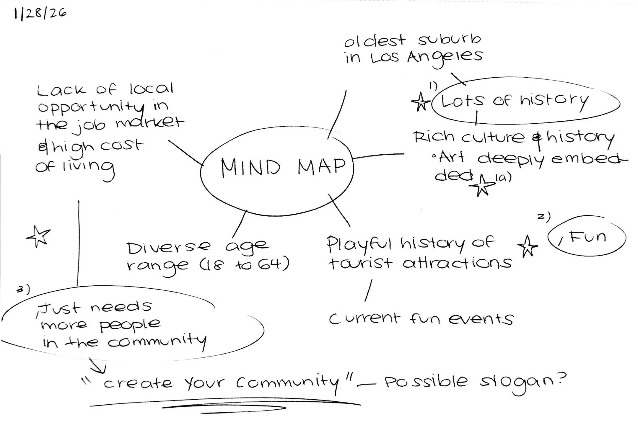
Building a logotype on existing design identity.
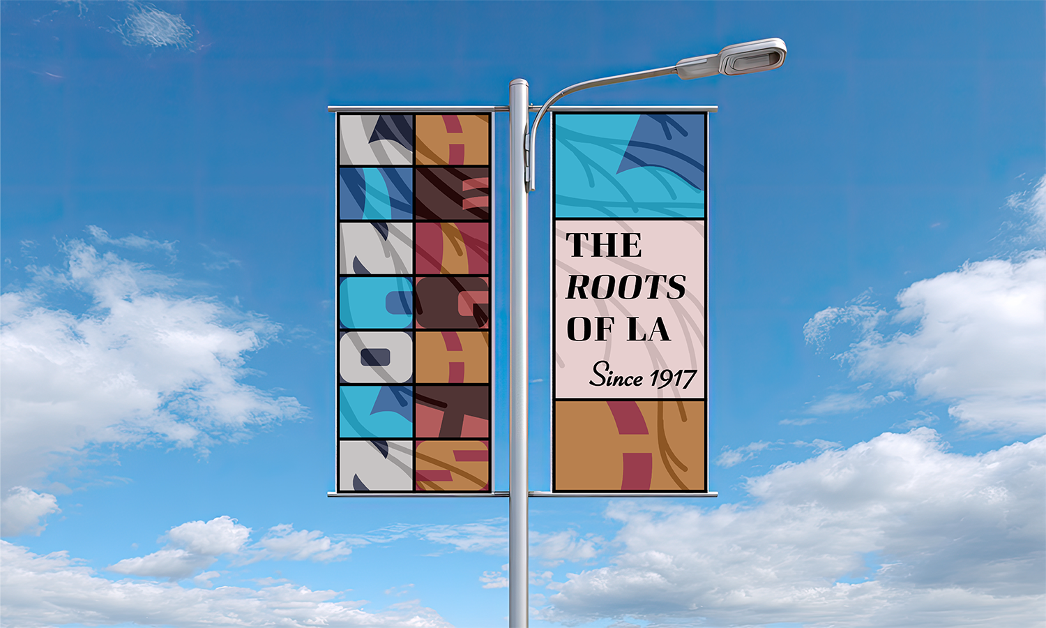
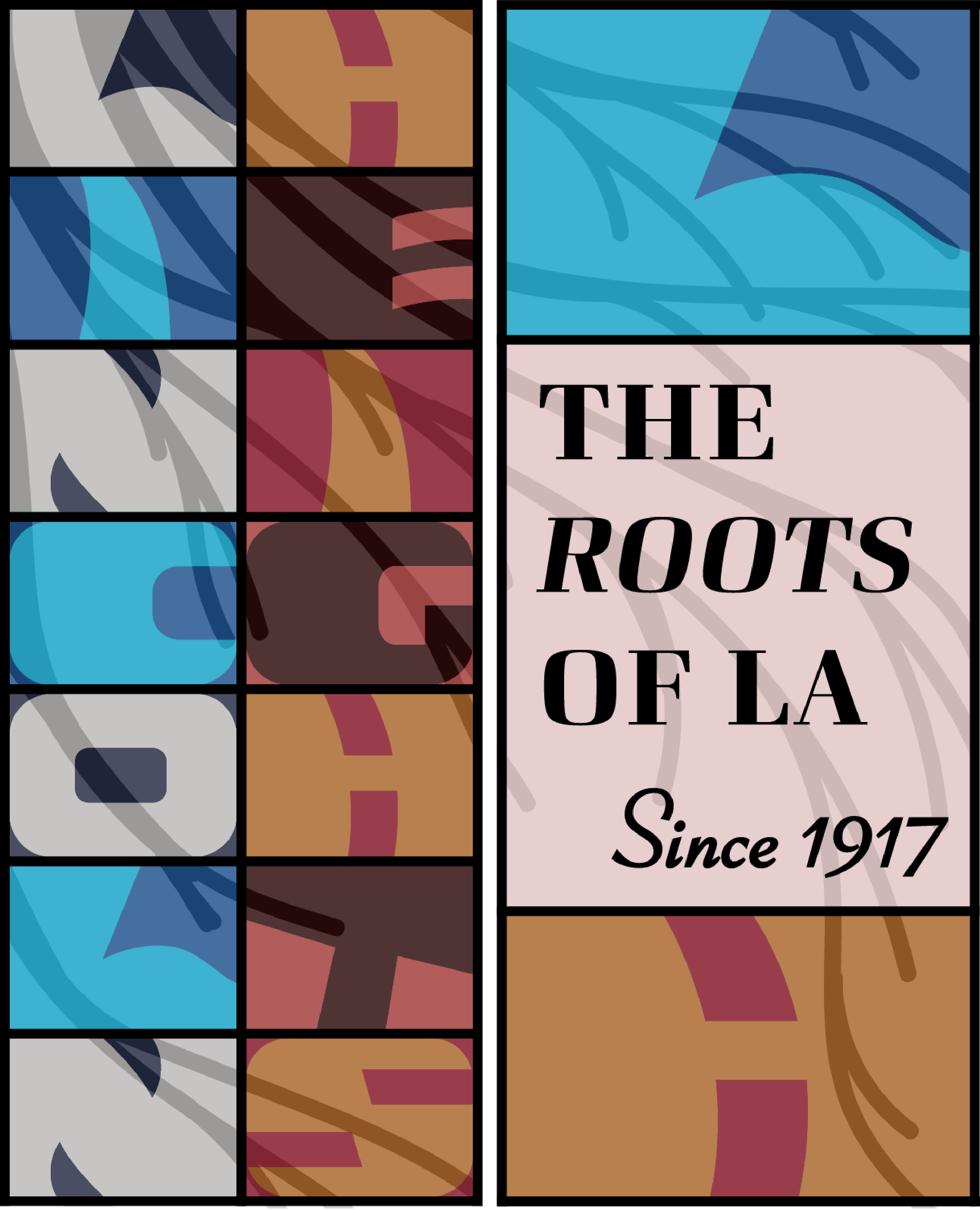
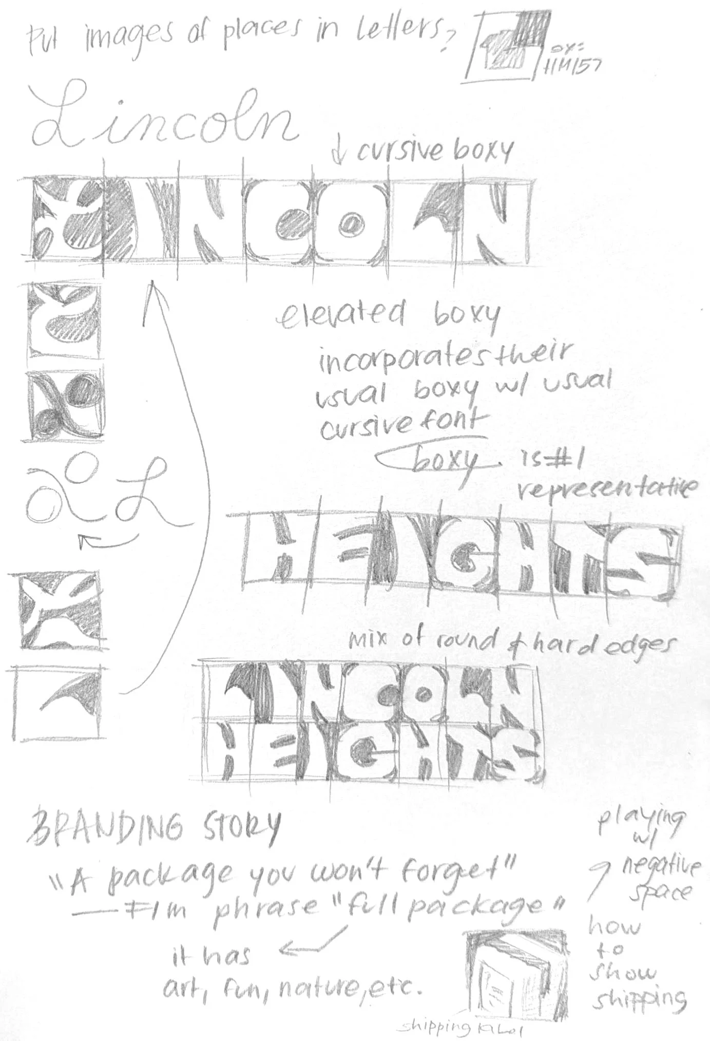
Using pre-existing neighborhood branding (community event posters and local brand logos) I noted recurring themes. Many community posters included a subtle nature motif, and disjointed typography between cursive and boxier lettering: neither of which felt unified or neighborhood specific. To retain both styles, I combined them within a gridded logo containing wavy type, balancing the looseness of the letters with a structured appearance. I applied this to the pole banners and poster, overlaying the visual symbol of the roots.
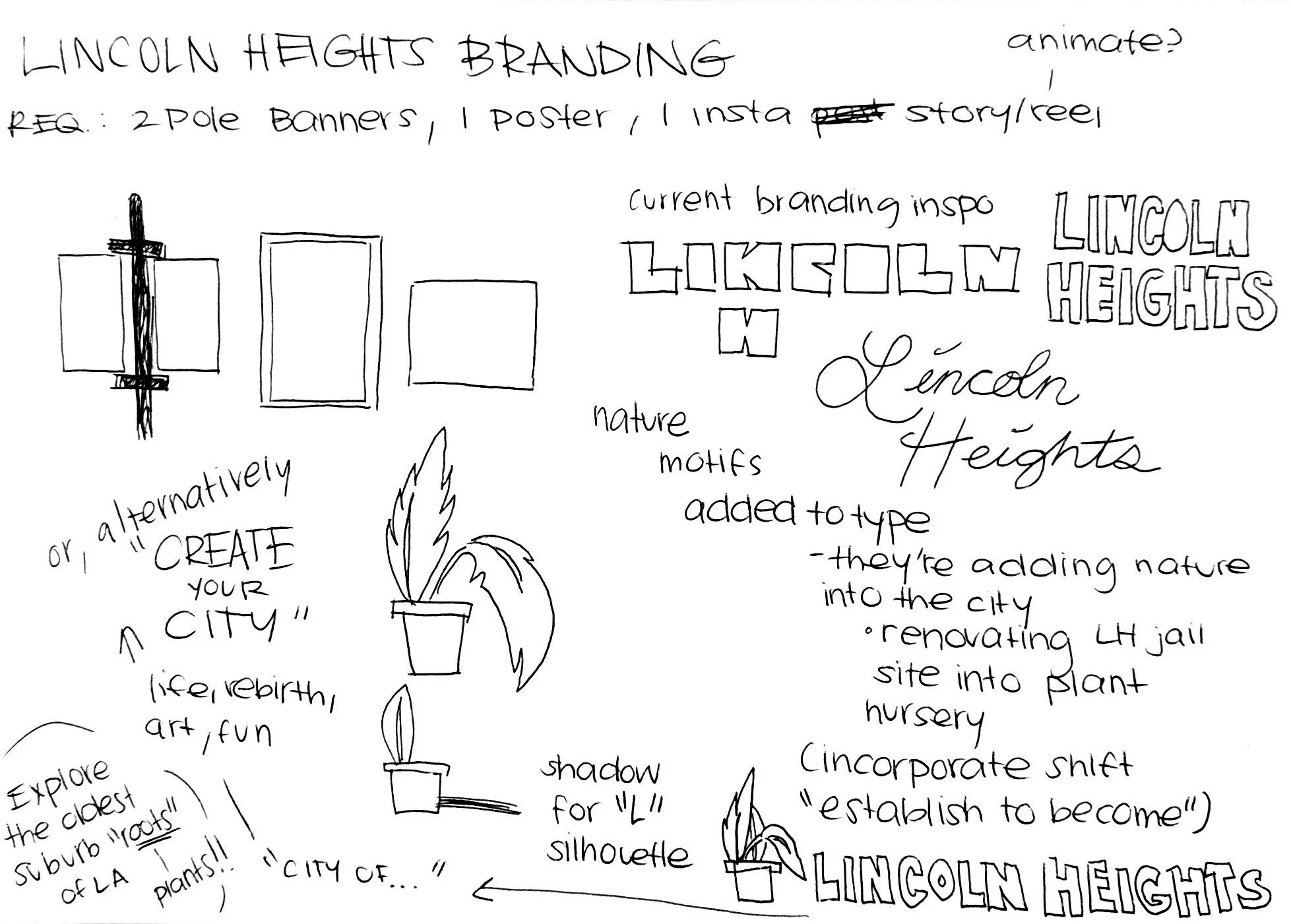
Finalizing the Ideas.
With a neighborhood visual identity set in place, it was time to take the tight line sketches to Adobe Illustrator. Building the custom lettering for Lincoln Heights, the grid was applied across all campaign assets. It uses a complimentary color palette with darker values to emphasize the bold design and reach a mature audience, while striking a balance between the feelings of trust (blue) and excitement (orange).
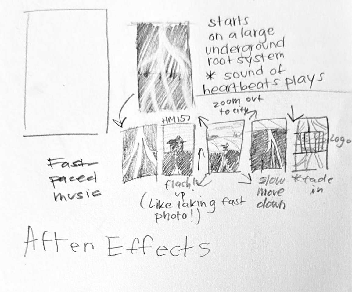
Poster Animation.
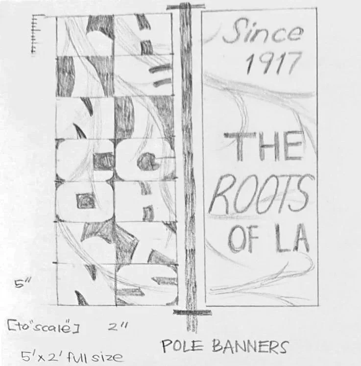
Pole Banners.